The challenge
The pen is in the letter
A writing brand should show its craft without a clip-art pen.
What we designed
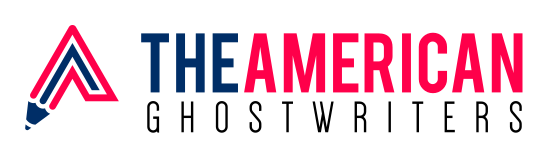
The A is cut like a nib and finished in red and blue, so the instrument and the initial are one shape.
A logo for a ghostwriting service: a pen-shaped A in red and blue beside bold navy lettering, with GHOSTWRITERS spaced out underneath.
Ghostwriting is a quiet service, but the brand still has to look credible and distinctly American. The logo needed to say writing at a glance.
The same logo in the versions a brand uses every day.
A short palette taken straight from the logo, and a check that it stays readable when it gets small.
Three jobs, and how the design answers each one.
A writing brand should show its craft without a clip-art pen.
The A is cut like a nib and finished in red and blue, so the instrument and the initial are one shape.
The name promises an American voice.
Red, white and blue appear as a restrained palette, not as flags or stars.
A long name has to stay readable.
THE AMERICAN is set heavy, while GHOSTWRITERS is light and widely spaced, which gives two clear levels.
Tell us about your business and we will show what a brand built around your customers could look like. Request a free review. No sales pitch and no obligation.