The challenge
A friendly voice
The name is warm and informal.
What we designed
Rounded lowercase letters keep the wordmark approachable and easy to read.
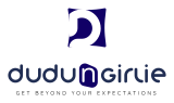
A logo for a lifestyle brand: a bold navy D tile with a cut-out detail, a rounded lowercase wordmark with a highlighted n and the line Get Beyond Your Expectations.
A name with two nicknames can feel casual, but the brand wanted to look polished. The logo needed to be friendly, memorable and strong enough to carry a product range.
The same logo in the versions a brand uses every day.
A short palette taken straight from the logo, and a check that it stays readable when it gets small.
Three jobs, and how the design answers each one.
The name is warm and informal.
Rounded lowercase letters keep the wordmark approachable and easy to read.
A letter mark needs something unusual.
A navy D tile has a cut-out that gives it movement and makes it feel designed, not typed.
The n in the name is a link between two words.
The n is set in a lighter blue, so the connection is visible and the logo has a focal point.
Tell us about your business and we will show what a brand built around your customers could look like. Request a free review. No sales pitch and no obligation.