The challenge
Two brothers, two letters
The name is about a partnership.
What we designed
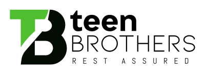
T and B interlock in a single block, so the monogram feels like two parts joined.
A logo for a family-run brand: a bold green and black TB monogram with a notch cut between the letters, beside teen BROTHERS with the line Rest Assured.
A brand named after brothers has to feel close, trustworthy and a little bold. The logo needed a monogram that is easy to stamp on a product and strong enough to carry a family name.
The same logo in the versions a brand uses every day.
A short palette taken straight from the logo, and a check that it stays readable when it gets small.
Three jobs, and how the design answers each one.
The name is about a partnership.
T and B interlock in a single block, so the monogram feels like two parts joined.
A consumer brand should feel lively.
A fresh green against heavy black gives the monogram contrast and confidence.
Customers want to feel safe buying.
The line Rest Assured sits in spaced capitals beside BROTHERS, a quiet promise of quality.
Tell us about your business and we will show what a brand built around your customers could look like. Request a free review. No sales pitch and no obligation.