The challenge
Food sells by sight
Visitors choose by how the food looks before reading any description.
What we designed
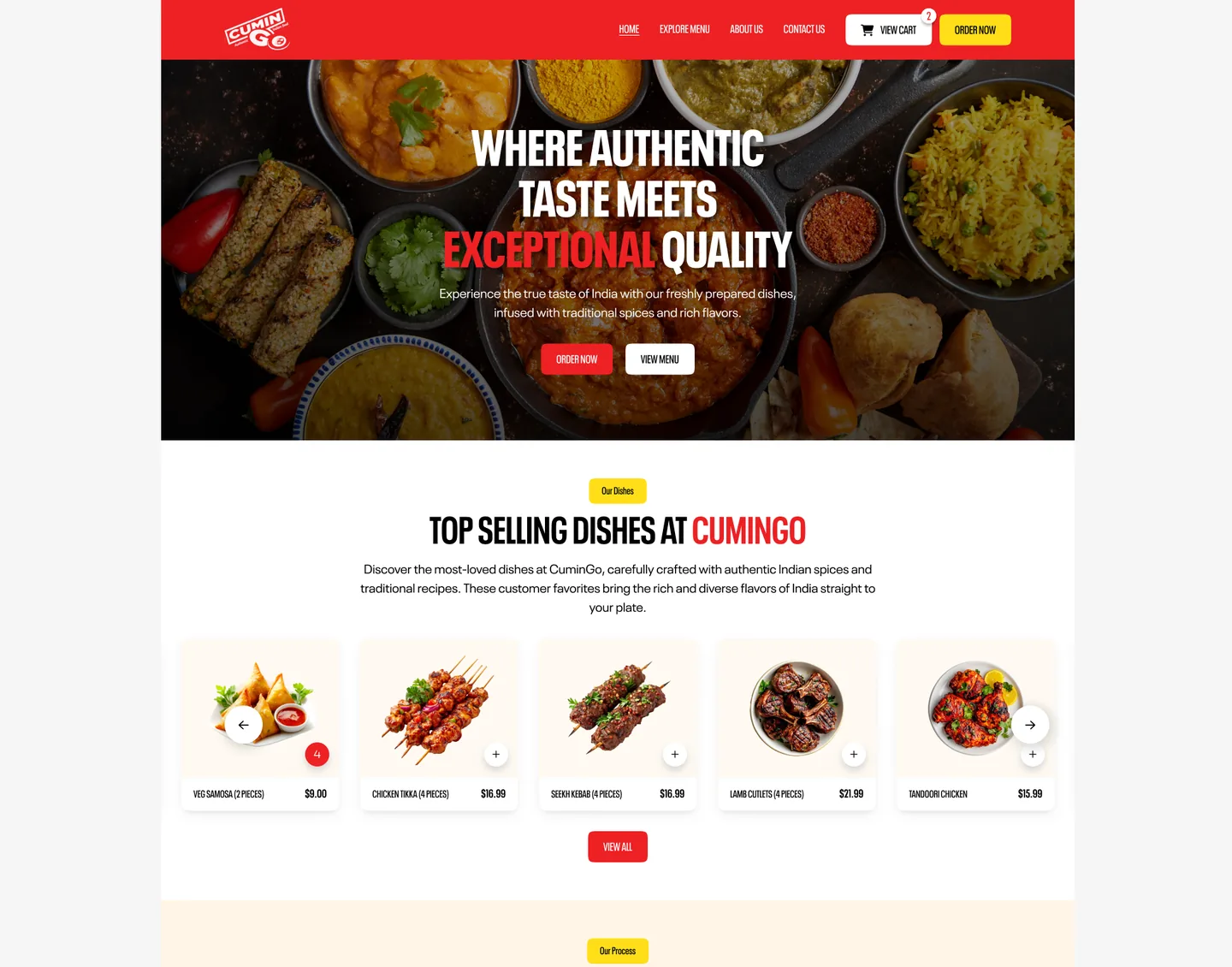
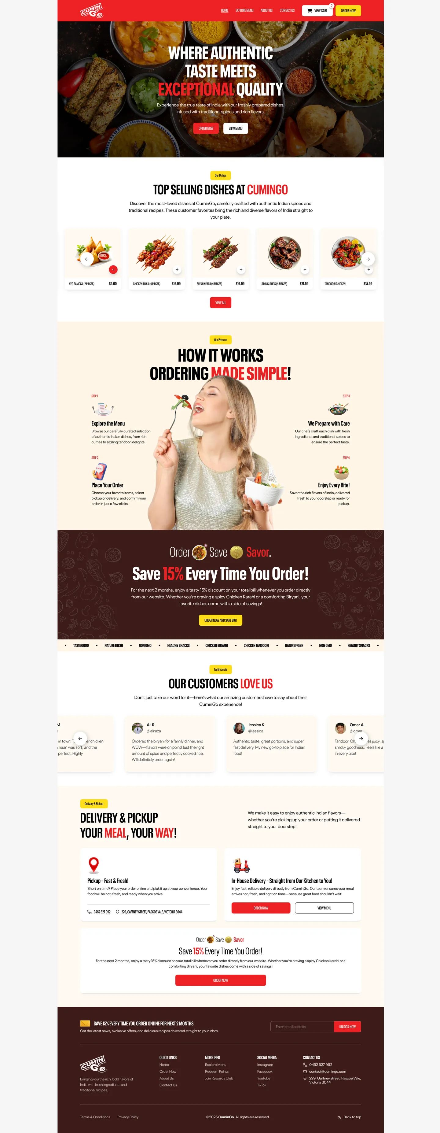
A large food photography hero opens the page, and each dish card leads with its photo, name and price.
A website for an Indian restaurant that takes orders online, designed around appetising photography, a menu that is fast to scan and a checkout that stays out of the way.
CuminGo wants customers to order directly instead of through delivery apps. The design needed to make the food look great, make ordering quick and explain why ordering direct is worth it.
Four challenges, and how the design answers each one.
Visitors choose by how the food looks before reading any description.
A large food photography hero opens the page, and each dish card leads with its photo, name and price.
A big menu with many categories can overwhelm someone who just wants dinner.
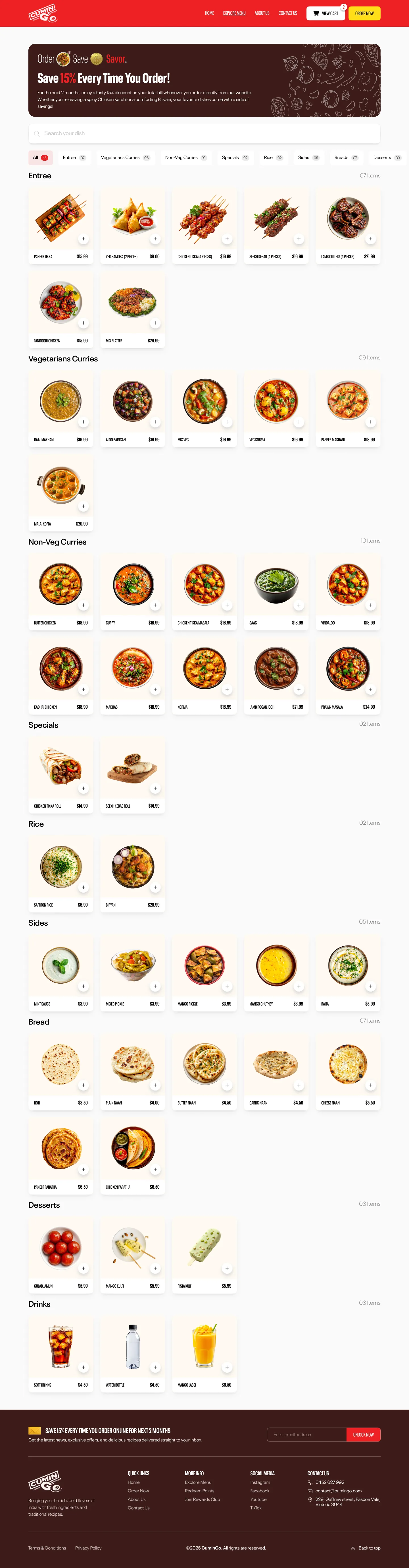
The menu page uses category filters, search and a compact grid with one-tap add buttons so people find and add dishes quickly.
Customers are used to delivery apps and need a reason to order here.
A repeated 15 percent offer banner and a four-step How It Works section make the benefit and the process clear.
Surprises at checkout lose orders.
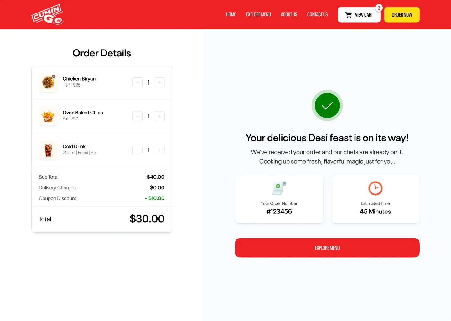
An order summary with quantity steppers, subtotal, discount and total, followed by a confirmation page with the order number and estimated time.
Scroll inside each browser to see the full page design.
The decisions that shape how the site looks and feels.
A bold palette and condensed type that feel lively and appetising.
Compact cards and tabs let customers build an order in a few taps.
The confirmation page tells the customer what happens next.
Other websites we have designed.
Tell us about your business and we will show what a design built around your customers could look like. Request a free review. No sales pitch and no obligation.