Book a call
Areas About Work Get a free audit

Help shoppers find the right fittings in seconds.

An e-commerce home page for a brand selling premium kitchenware, bathware, doorware and tapware, designed to move shoppers into the right category and then straight to products.

nextyl.com
Nextyl website design
  • IndustryKitchen, bath and doorware e-commerce
  • LocationAustralia
  • ServiceWeb Design
  • DeliverableHome page design

Nextyl sells hardware and fittings across several categories. The design had to feel premium, send shoppers to the right category quickly and show products in a clean way that makes buying easy.

What the design had to solve.

Four challenges, and how the design answers each one.

The challenge

Many categories, one entry point

Shoppers arrive looking for very different things, from door handles to taps.

What we designed

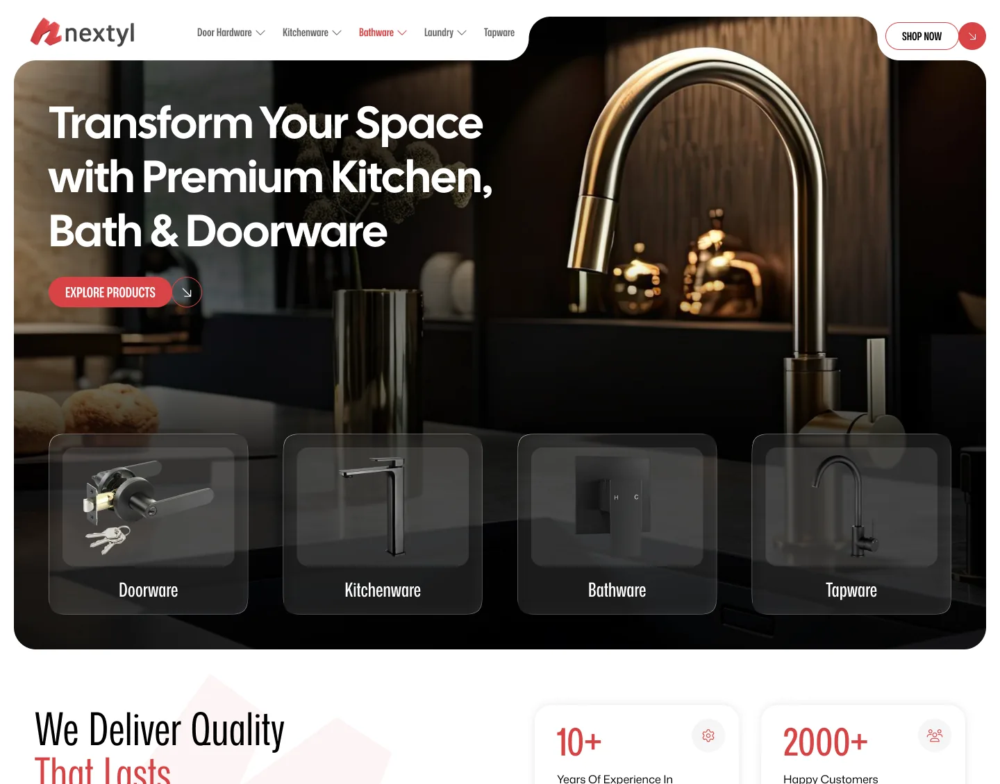
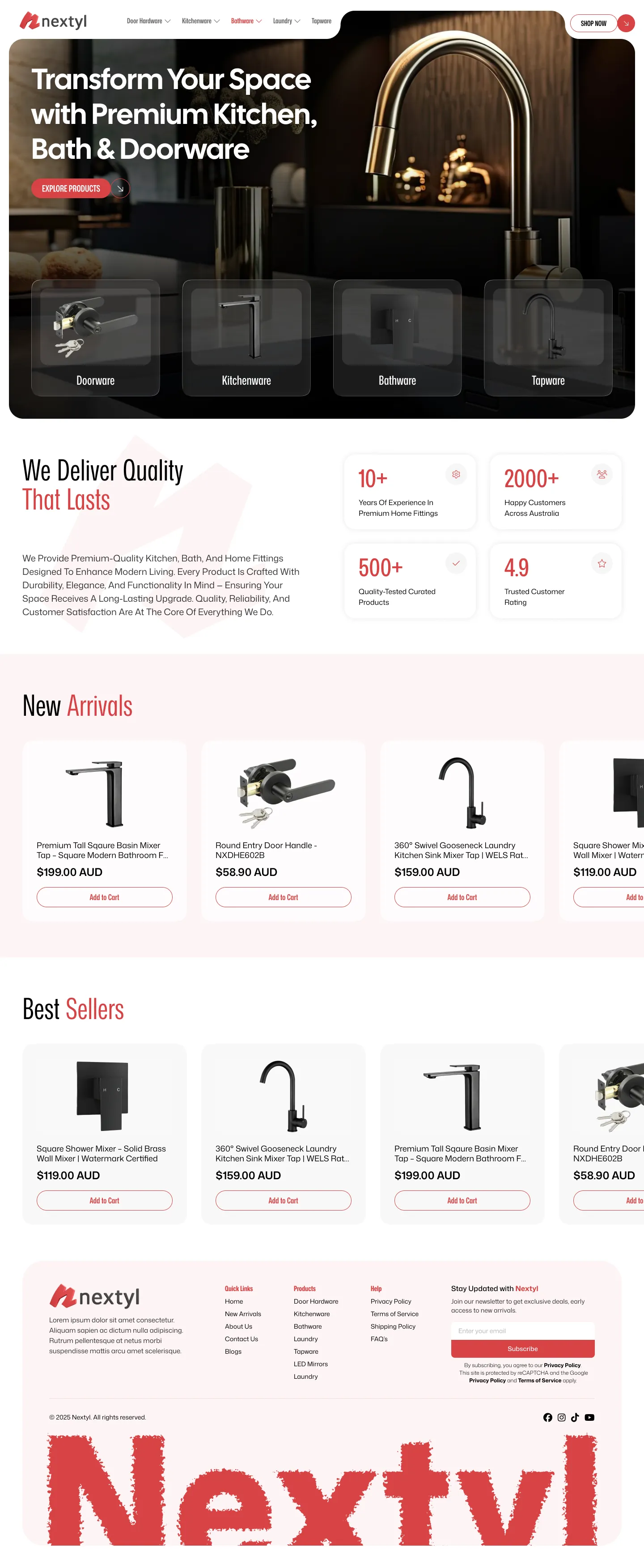
Four category tiles, Doorware, Kitchenware, Bathware and Tapware, sit inside the hero so shoppers start in the right aisle immediately.
The challenge

Premium products must look premium

Fittings are chosen by finish and feel, and a cluttered page lowers that perception.

What we designed

A moody hero photograph, clean product cards on a light background and generous spacing keep the focus on the products.

The challenge

Trust before checkout

Buyers want to know the brand is established before spending.

What we designed

A brand story section is paired with key facts, such as years of experience, customers and rating, rather than long paragraphs.

The challenge

Browsing should lead to buying

People scan quickly and expect to act on what they see.

What we designed

New Arrivals and Best Sellers carousels show product, price and an Add to Cart button on every card.

Selected pages.

Scroll inside each browser to see the full page design.

nextyl.com
Nextyl home page
Home pageA dark, atmospheric hero with four category tiles, a short brand story with key facts, and product rows for new arrivals and best sellers.

Design choices that mattered.

The decisions that shape how the site looks and feels.

A rich dark hero with a warm light body

The contrast gives the brand weight at the top and keeps the shop area easy to read.

Red as the single accent

One strong accent colour marks prices, buttons and key moments.

A consistent product card

The same card layout in every row makes comparing products quick.

Want a website like this?

Tell us about your business and we will show what a design built around your customers could look like. Request a free review. No sales pitch and no obligation.

  • A plan built around your customers
  • No long-term contracts
  • Reply within one business day

Get my website plan

We'll only use your details to reply to your request.
Thank you! We'll be in touch within one business day.